With the addition of an accelerometer being a common feature in our smart devices, it has allowed us to view applications and websites in new ways. This capability provides opportunities to create better, more in depth user experiences because it offers an additional layout with a simple turn of a device, without the press of a button. However, designing for device orientation requires careful thinking. It is important that the experience is transparent and that the functionality is understandable. For example, it is very confusing to the user when a device switches from landscape to orientation mode only to present a brand new interface. In this article, I'll present some basic ideas and concepts designers should be aware of when designing for device orientation.
Secondary Display
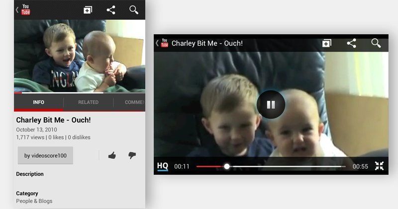
There are times when a secondary display can be beneficial. YouTube's new mobile application is a great example of device orientation design. The portrait mode offers an interface for browsing videos and displays the user's account information. Switching to landscape mode provides an experience with a full-screen video player, playback controls, and nothing more. When the video ends, the display switches back to portrait mode, prompting users to quickly tilt the device back and browse for additional videos.
YouTube:

To help better understand how we can use orientation to our advantage lets first look at a couple different ways in which we can use this functionality.
Fluid Design
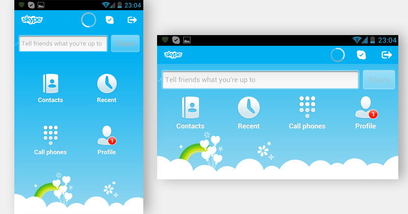
This interface design is nothing more than just scaling the interface to its new size. Take for example the Skype application, you can see all the features are still present in both modes and the only difference is the size.

Complementary
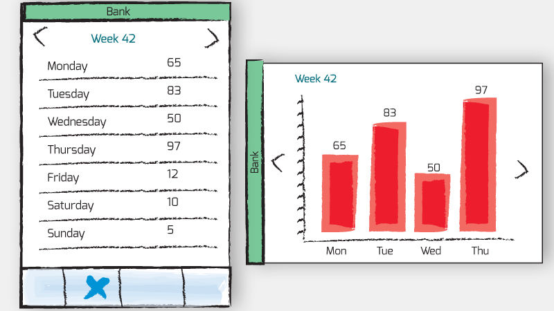
With this interface, we can make the interface change only slightly to show a different view of the same content. For example, if we are looking at data in spreadsheet form on the portrait mode, flipping the device to show a graph with the same dataset might be a cool, productive, and user-friendly feature that one may expect.
Dataset:

Continuous
Like the new YouTube app, a continuous design enables the user to access a secondary interface by rotating the device. For example, a smartphone as a remote control for a TV in portrait while the landscape mode would display a programming guide, while also maintaining functionality for changing channels, browsing programs and recording future episodes.
Understanding The Context
Overall, it is important to understand the context in which your application will be used. Completely changing the information displayed across the two modes will could confuse the user and deter them from using your application. However, with careful consideration in the design process, the functionality of device orientation can provide huge productive benefits and give the user an enjoyable experience and ultimately, provide more engaging and user-friendly experiences.